Hyde
Innovative, privacy-driven customer insights
Deliverables:
Brand Strategy
Logo Design
Visual Brand Language
Website Concept
Hyde is a privacy-driven, consumer application that permits data monetisation while simultaneously providing next-gen customer insight. Being in its infancy, Hyde didn't have a logo design or brand to speak of, and this needed to change to grow the brand and take it to the next level.
Led by the brand strategy I developed with the team at Hyde, I created a minimalist logo design that references the data that Hyde works with. The negative space in the centre of the icon houses an uppercase 'H'. While being a playful nod to the verb 'hide', it also symbolises the process of multiple sources coming together to form a bigger picture, with Hyde at the heart of it.
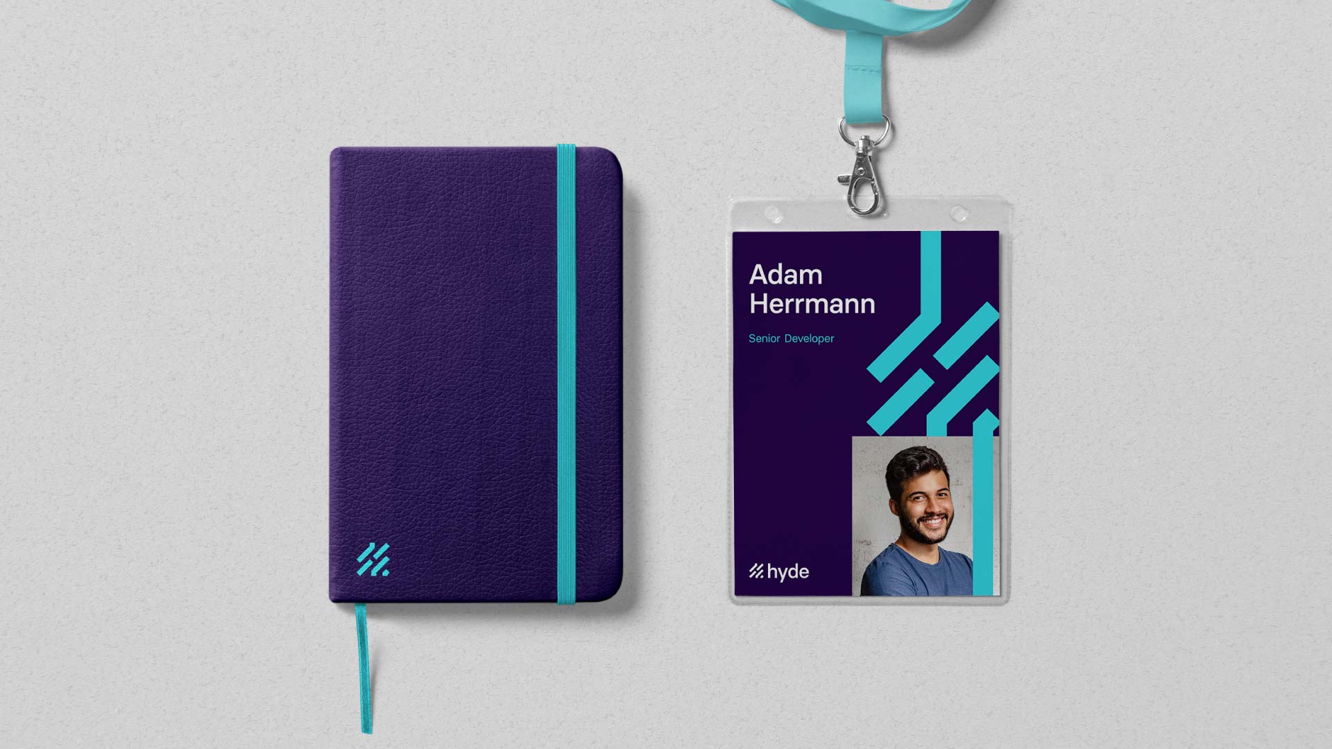
Following the logo design, I visualised how the branding could expand into various brand materials. The logo design lends itself to physically growing and building a network of lines that can interact with other graphics, such as photography, illustrations and text.


If you feel like I would be a good fit for your project, or you would just like to have a chat, please drop me an email, I can't wait to hear from you.